
Pointing the Finger
March 10, 2010
on
on
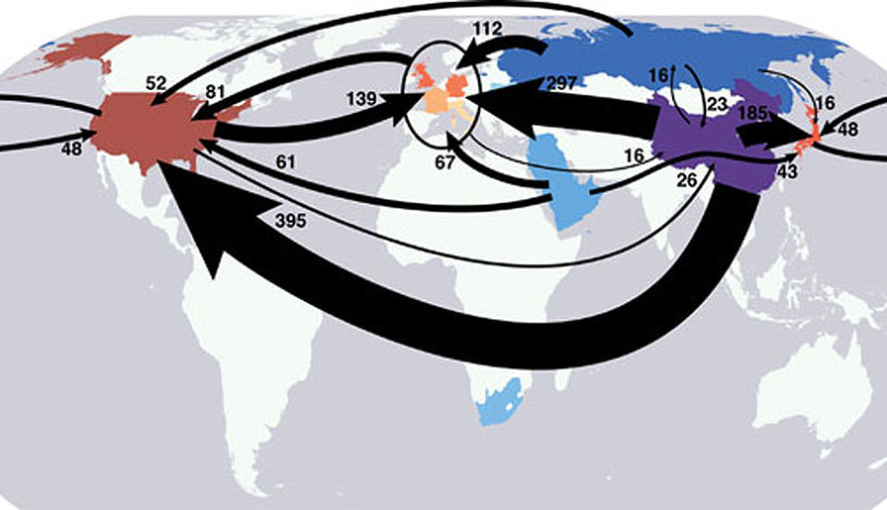
Check out this awesome infographic. It shows the global 'export of carbon emission' (numbers are megatonnes of CO2). Basically, when the US imports cheaply produced shoes from China, China gets the carbon emission added up to their grand total. However, the US basically 'created' this carbon emission, by buying. Ofcourse, that's a bit too easy to say: the real causalities are much more complex.
Still, the infographic is amazing and shows some interesting things. Created by researchers at the Carnegie Mellon University, it's based on trade data of 2004 (from a pre-crisis period, would that make a difference?). An important observation follows from the infographic - according to the researchers: "carbon emissions policy must take total emissions into account, not just the domestic emissions of each country".
In the end however, it's obviously only the global or total figure that counts: mother nature dun' know no borders! But making people aware of this 'outsourcing of carbon emission' is still a great goal. Hooray for awareness-creating and intuitive infographics!
Image: Steven Davis/Carnegie Institution for Science

Read more at CBC
Read full article
Hide full article
Discussion (1 comment)