
Data Analysis and Artificial Intelligence in Python
on
Terms such as big data and artificial intelligence have become a permanent entry in our everyday language. This is primarily due to two factors. This first is the increasing and pervasive diffusion of data acquisition systems that has allowed the creation of virtually endless knowledge repositories. The second is the continued growth in computational capability, due to the widespread use of GPGPUs (general-purpose graphics processing units) [1], which has made it possible to tackle computational challenges whose resolution was once considered essentially impossible.
Let's start with the description of an application scenario that will accompany us through this article. Let’s imagine having to monitor an entire production chain (the precise product does not play a role here). We have the ability to acquire data from a wide range of sources. For example, we can place sensors along the entire production line, or make use of contextual information that indicates the age and type of each machine. This set of data, or dataset, can be used for different purposes. This could include predictive maintenance, allowing us to evaluate and predict the occurrence of abnormal situations, plan orders for replacement parts, or undertake repairs before failures occur, all of which result in cost savings and increased productivity. In addition, the knowledge of the data's history allows us to correlate the data measured by each sensor, highlighting possible cause/effect relationships. As an example, if a sudden increase in temperature and humidity of the room was followed by a decrease in the number of pieces manufactured, it may be necessary to make changes that maintain constant climatic conditions using air conditioning.
The implementation of such a system is certainly not within everyone's reach. However, it is simplified by the tools made available by the open source community. All that is required is a PC (or, alternatively, our trusty Raspberry Pi can be used, if the amount of data to be processed is not huge), a knowledge of Python (which you can deepen by following a tutorial like this [2]) and, of course, some knowledge of the 'tools of the trade'. OK — let's get started and discover them together!
The tools of the trade
Needless to say, we must be able to create programs written in Python. To do so, we will have to install the interpreter. This can be found on the official Python website [3]. In the rest of this article we will assume that Python has already been installed and added to the system environment variables.
The virtual environment
Once the Python setup is complete, it is time to set up a virtual environment. This is implemented as a sort of ‘container’ that is separate from the rest of our system and into which the libraries used are installed. The reason for using a virtual environment for the global installation of libraries relates to the rapid evolution of the Python world. Very often, substantial differences arise even between minor releases of the interpreter, resulting in libraries (and, consequently, programs) that are incompatible as they were written for different Python versions. By having a deterministic environment where we know the version of each single installed library provides a sort of ‘guarantee’ that our programs will function. In fact, it will be enough to replicate precisely the configuration of the virtual environment and we can be sure that everything will work.
To manage our virtual environments we use a package called virtualenvwrapper. This can be installed from the shell by using pip:
$ pip install virtualenvwrapper
Once the installation is complete we create a new virtual environment as follows:
$ mkvirtualenv ml-python
Note that ml-python is the name of the virtual environment chosen for our example scenario. Obviously, such names can vary and an appropriate name can be chosen by the developer. We proceed next by activating the virtual environment:
$ workon ml-python
We are now ready to install the elements necessary to follow the rest of the article.
Libraries
The libraries that we present and use here are the five most-used for data analysis in Python. The first, and perhaps most famous, is NumPy, which can be considered a sort of port of MATLAB for Python. NumPy is a library for algebraic and matrix calculations. As a result, those who regularly use MATLAB will find many similarities, both in terms of syntax and optimization. Using algebraic calculation in NumPy is, in fact, more efficient than nested cycles in MATLAB (to learn more, I leave you the link to this article [4]). Predictably, the type of data at the core of NumPy’s functionality is the array. This is not to be confused with the corresponding computer vector but should instead be understood in the algebraic and geometric sense as a matrix. Since data analysis is based on algebraic and matrix operations, NumPy is also the basis for two of the most used frameworks: scikit-learn (covered shortly) and TensorFlow.
A natural complement to NumPy is pandas, a library that manages and reads data from heterogeneous sources, including Excel spreadsheets, CSV files, or even JSON and SQL databases. pandas is extremely flexible and powerful, allowing you to organize data into structures called dataframes that can be manipulated as required and exported with ease directly into NumPy arrays.
The third library we will use is scikit-learn. Born from an academic project, scikit-learn is a framework that implements most of the machine learning algorithms used nowadays by providing a common interface. The latter concept is precisely that of object-oriented programming: it is, in fact, possible to use virtually every algorithm offered by scikit-learn through the fit_transform method by passing at least two parameters, such as the data under analysis and the labels associated with it.
The last two libraries we will use are Matplotlib and Jupyter. The first one, together with its complement Seaborn, is necessary to visualize the results of our experiments in the form of graphs. The second offers us the use of notebooks, interactive environments of simple and immediate use that allows the data analyst to write and execute parts of code independently from the others. Before proceeding further, however, we will introduce some theoretical concepts that are needed to build a ‘common base’ for discourse.
The concepts
The first concept required is that of datasets, something that is often simply taken for granted. These are sets of samples, each of them characterized by a certain number of variables or features, that describe the phenomenon under observation. For simplicity we can think of a dataset as an Excel spreadsheet. The rows provide the samples, that is the individual observations of the phenomenon, while the columns provide the features, that is the values that characterize each of the aspects of the process. Returning to the example of smart manufacturing, each row will represent the conditions of the production chain at a given moment while each column will indicate the reading of a given sensor.
When we talked about scikit-learn, we briefly mentioned the concept of label or class. The presence or absence of labels allows you to distinguish between supervised and unsupervised algorithms. The difference is, at least in principle, quite simple: supervised algorithms require a priori knowledge of the class of each sample in the example dataset, while the unsupervised algorithms do not. In practical terms, to use a supervised algorithm it is required that a domain expert establishes the class of belonging for each sample. In the case of a smart manufacturing process, an 'expert' could determine if a set of readings, from a specific moment of time, represent an abnormal situation or not. Thus the single sample can be associated with one of these two possible classes (abnormal/normal). This is not necessary for unsupervised algorithms.
Futhermore, a distinction must be made between processes with independent and identically distributed data (IID) and with data in a chronological order. The difference is related to the nature of the phenomenon under observation. Samples of an IID process are independent of each other, while in a time series each sample depends on a linear or non-linear combination of the values that the process output at previous points in time.
Let's get started!
With the necessary theoretical and practical terms covered, we move on to using a suitable dataset for our example case. The dataset used is SECOM, an acronym that stands for SEmiCOnductor Manufacturing, that contains the values read by a set of sensors during the monitoring of a semiconductor manufacturing process. In the dataset, which can be downloaded from different sources (such as Kaggle [5]) there are 590 variables, each of which is representative of the reading of a single sensor at a given instance in time. The dataset also contains labels that distinguish failures and anomalies from the proper functioning of the system.
Once the dataset is downloaded, we install the libraries mentioned above. From the command line, enter:
$ pip install numpy pandas scikit-learn matplotlib seaborn jupyter numpy pandas install
Once the libraries are installed we can set up a simple pipeline for data analysis.
The first notebook
The first step is to create a new notebook. From the command line we launch Jupyter using the following instruction:
$ jupyter-notebook
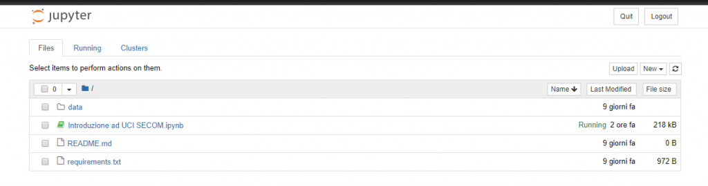
A screen similar to the one shown in Figure 1 will open.
We create a notebook by selecting New > Python 3. A new tab will open in our browser with the newly created notebook. Let's take a moment to familiarize ourselves with the interface, shown in Figure 2, which resembles (very vaguely) an interactive command line, a top menu, and several options.
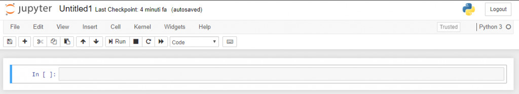
The first thing that jumps out is the cell, one part of the view we can now see. The execution of single cells is initiated by the Run button and is independent from that of the other cells (we must keep in mind that the concept of scope of variables remains valid).
The three buttons immediately to the right of the Run button allow you to stop, reboot and reset the kernel, i.e. the instance that Jupyter associates to our notebook. Restarting the instance may be necessary to reset the local and global variables associated with the script, which is especially useful when you are experimenting with new methods and libraries.
Another useful option is the one that allows you to select the cell type, choosing between Code (i.e. Python code), Markdown (useful for inserting comments and descriptions in the format used, for example, by GitHub READMEs), Raw NBContent (plain text) and Heading (offering a shortcut to insert titles).
Importing and displaying data
Once we are familiar with the interface we can move on to implement our script. Here we import the libraries and modules that we will use:
import numpy as np
import pandas as pd
import matplotlib.pyplot as plt
%matplotlib inline
import seaborn as sns
from ipywidgets import interact
from sklearn.ensemble import RandomForestClassifier
from sklearn.impute import SimpleImputer
from sklearn.model_selection import train_test_split
from sklearn.preprocessing import StandardScaler
from sklearn.metrics import confusion_matrix, accuracy_score
from sklearn.utils import resample
It is worth highlighting the instruction %matplotlib inline that allows us to display the graphs produced by Matplotlib correctly.
Next, the data of the file containing the SECOM dataset is imported using the pandas read_csv function. Note that, in this example, the relative path to the file is hardcoded for the sake of simplicity. However, it would be advisable to use the Python os package to allow our program to determine this path itself when required.
data = pd.read_csv('data/secom.csv')
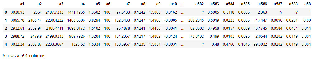
The previous instruction reads in the data contained in the secom.csv file, organizing it in a dataframe named data. We can display the first five lines of the dataframe through the head() instruction, as shown in Figure 3.
data.head()
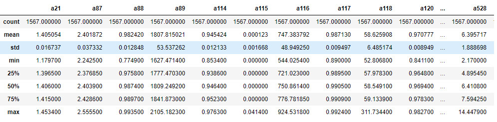
Visualizing the first lines of the dataframe can be useful to have a first overview of the data to analyze. In this case we immediately notice the presence of some values equal to '?' that presumably represent null values. Moreover, it is evident that the range of the values vary greatly, a factor that we will have to keep in mind later on. We can also use the describe() function to get a quick overview of the statistical characteristics of each variable (Figure 4).
data.describe()
Statistical analysis can, in general, highlight conditions with a lack of normalcy (i.e., data distributed according to a non-parametric distribution), or the presence of anomalies. To offer an example, we note that the standard deviation (std) associated with the variables a116 and a118 is, proportionally, quite high, so we expect a high significance of these variables in their analysis. On the other hand, variables such as a114 have a low std, so they are expected to be discarded as they are not very explanatory with respect to the process being analyzed. Once the loading and display of the dataframe is complete, we can move on to a fundamental part of the pipeline: preprocessing.
Preprocessing data
As a first step we display the number of samples associated with each class. To do so, we will use the value_counts() function on the classvalue column as it contains the labels associated with each sample.
data['classvalue']. value_counts()
We see that there are 1463 samples collected in the normal operating situation (class -1) and 104 in the failure situation (class 1). The dataset is therefore strongly imbalanced and it would be appropriate to undertake steps to make the distribution of samples between the different classes more 'uniform'. This relates back to the intrinsic functionality of machine learning algorithms that learn on the basis of the data available to them. In this specific case, the algorithm will learn to characterize a situation of standard behavior successfully, but will have 'uncertainties' in characterizing abnormal situations. The unbalance is even more evident when looking at the scatterplot (shown in Figure 5):
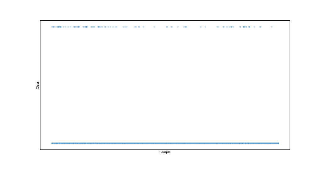
sns.scatterplot(data.index, data['classvalue'], alpha=0.2)
plt.show()
With this imbalance in mind (we'll come back to it later), we proceed to 'separate' the labels from the data:
labels = data['classvalue']
data.drop('classvalue', axis=1, inplace=True)
Note the use of the axis parameter in the drop function that allows us to specify that the function must operte on the columns of the dataframe (by default, pandas functions operate on the rows).
Another aspect that can be extrapolated from the dataset analysis is that, in this specific version of SECOM data, many columns contain data of different types (i.e. both strings and numbers). As a result, pandas is unable to uniquely determine the type of data with which each feature is represented and defers the definition of this to the user. Therefore, to bring all data into numerical format, it is necessary to use three functions offered by pandas.
The first function we will use is replace(), with which we can replace all question marks with the constant value numpy.nan, the placeholder used to handle null values in NumPy arrays.
data = data.replace('?', np.nan, regex=False)
The first parameter of the function is the value to replace, the second is the value to use for the replacement, and the third is a flag indicating whether or not the first parameter represents a regular expression. We could also use an alternative syntax using the inplace parameter set to True, as follows:
data.replace('?', np.nan, regex=False, inplace=True)
The second and third functions that we can use to solve the problems highlighted above are the apply() and to_numeric() functions respectively. The first allows you to apply a certain function to all columns (or rows) of a dataframe, while the second converts a single column into numeric values. By combining them we generate unique data and we will also remove the values that cannot be handled by NumPy and scikit-learn:
data.apply(pd.to_numeric)
We now need to evaluate which features among those contained in the dataset are actually useful. We typically use techniques (of higher or lower complexity) of feature selection to reduce redundancies and the size of the problem to be treated, delivering obvious benefits in terms of processing time and performance of the algorithm. In our case, we rely on a less complex technique that involves the elimination of features of low variance (and therefore, as mentioned above, of low significance). We create, therefore, an interactive widget that allows us to visualize, in the form of a histogram, the distribution of data for each feature:
@interact(col=(0, len(df.columns) - 1)
def show_hist(col=1):
data['a' + str(col)]. value_counts().hist(grid=False, figsize=(8, 6))
Interactivity is ensured by the decorator @interact, whose reference value (i.e. col) varies between 0 and the number of features present in the dataset. Exploring the displayed data through the widget, we will determine how many features assume a single value, meaning they can be simply overlooked in the analysis. We can then decide to eliminate them as follows:
single_val_cols = data.columns[len(data)/data.nunique() < 2]
secom = data.drop(single_val_cols, axis=1)
Of course, there are more relevant and refined feature selection techniques using, for example, statistical parameters. For a complete overview, the scikit-learn documentation can be consulted [6].
The last step is to deal with the null values (which we replaced previously with np.nan). We inspect the dataset to see how many there are; to do so, we use a heatmap, as shown in Figure 6, where the white points represent the null values.
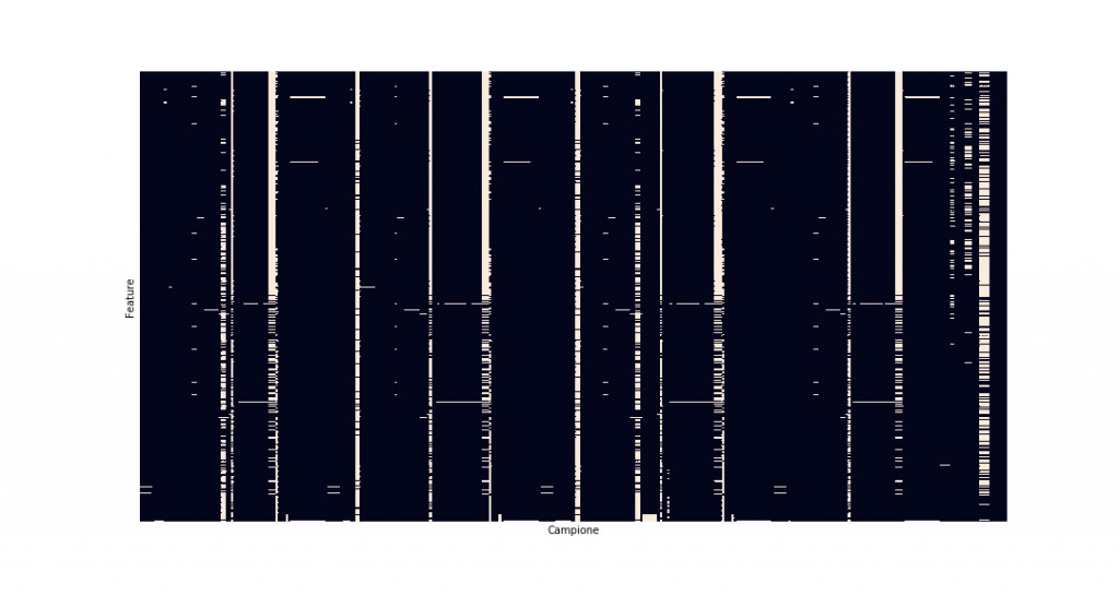
sns.heatmap(secom.isnull(), cbar=False)
It is evident that many samples show a high percentage of null values that should not be considered in order to remove the bias effect on the data.
na_cols = [col for col in secom.columns if secom[col]. isnull().sum() / len(secom) > 0.4]
secom_clean = secom.drop(na_cols, axis=1)
secom_clean.head()
Thanks to the previous commands, a comprehension list has now isolated all features with more than 40% null values, allowing them to be removed from the dataset.
The features with less than 40% of null values still need to be dealt with. Here we can use our first scikit-learn object, the SimpleImputer, which assigns values to all NaNs based on a user-defined strategy. In this case, we will use an average (mean) strategy, associating the average value assumed by the feature to each NaN.
imputer = SimpleImputer(strategy='mean')
secom_imputed = pd.DataFrame(imputer.fit_transform(secom_clean))
secom_imputed.columns = secom_clean.columns
As an exercise, we can verify that we have no zero values in the dataset through another heatmap (which, predictably, will assume a uniformly dark color). Then we can move on to the actual processing.
Data processing
We will divide our dataset into two sub-sets: one training and one test. This subdivision is necessary to mitigate the phenomenon of overfitting, which makes the algorithm 'adhere too much' to the data (see here for more background [7]), and ensures the the model's applicability to cases different from the ones upon which it was trained. To do this, we use the train_test_split function:
X_train, X_test, y_train, y_test = train_test_split(secom_imputed, labels, test_size=0.3)
Using the test_size parameter we can specify the percentage of data reserved for the test; the standard values for this parameter usually range between 0.2 and 0.3.
It is also important to normalize the data. We have already noticed that some features assume values with much higher variation than others, and this will result in them being given more weight. Normalizing them allows you to bring them within a single range of values so that there are no imbalances due to initial offsets. To do this, we use StandardScaler:
scaler = StandardScaler()
X_train = pd.DataFrame(scaler.fit_transform(X_train), index=X_train.index, columns=X_train.columns)
X_test = pd.DataFrame(scaler.fit_transform(X_test), index=X_test.index, columns=X_test.columns)
It is interesting to note the usefulness of the common interface offered by scikit-learn. Both scaler and imputer use the fit_transform method to process data that, in complex pipelines, greatly simplifies code writing and library understanding.
We are now finally ready to classify the data. In particular, we will use a random forest [8], obtaining, after training, a model able to distinguish between normal and abnormal situations. We will verify the performance of the model identified in two ways. The first is the accuracy score. This is the percentage of samples belonging to the test set correctly classified by the algorithm. The second is the confusion matrix [9] that highlights the number of false positives and false negatives.
First, we create the classifier:
clf = RandomForestClassifier(n_estimators=500, max_depth=4)
This creates a random forest with 500 estimators whose maximum depth is 4 levels. Now we can train our model on training data:
clf.fit(X_train, y_train)
Once the training is finished, the trained model is used to classify the test samples:
y_pred = clf.predict(X_test)
This results in two labels that relate to each of the two tests. The first one, belonging to y_test, represents the 'truth', while the second one, belonging to y_pred, is the value predicted by the algorithm. By comparing them we determine both the accuracy and the confusion_matrix.
accuracy = accuracy_score(y_test, y_pred))
cf = confusion_matrix(y_test, y_pred))
The example generates the following results:
Model accuracy on test set is: 0.9341825902335457
The confusion matrix of the model is:
[[440 0]
[ 31 0]]
The accuracy, which is around 93%, is very good, so the model looks good. However, we note that the model is very accurate at classifying the samples of the predominant class, but equally inaccurate in classifying the samples belonging to the minority class. Thus a bias is evidently present. Therefore, we need a strategy to improve this situation. This can be performed by upsampling the data belonging to the minority class so as to balance, at least partially, the dataset. To do this we will use the pandas resample function.
normals = data[data['classvalue'] == -1]
anomalies = data[data['classvalue'] == 1]
anomalies_upsampled = resample(anomalies, replace=True, n_samples=len(normals))
This increases the size of the dataset in order to bring the number of normal samples closer to the number of abnormal samples. As a result we have to redefine both X and Y as follows:
upsampled = pd.concat([normals, anomalies_upsampled])
X_upsampled = upsampled.drop('classvalue', axis=1)
y_upsampled = upsampled['classvalue']
By performing the training again (including repeating the split and normalization procedures) we acquire the following results for our example:
Model accuracy on test set is: 0.8631921824104235
The confusion matrix of the model is:
[[276 41]
[ 43 254]]
We immediately notice that the accuracy of the model has decreased. This is presumably due to the greater heterogeneity induced in the dataset. However, looking at the confusion matrix, we immediately notice that the model has in reality improved its generalization capabilities, also succeeding in correctly classifying samples belonging to anomalous situations.
Conclusions and references
In this article we introduced a pipeline for the analysis of data from real processes in Python. It is clear, however, that each of the topics covered is extremely diverse and theoretical and practical experience is essential if you want to seriously engage in data analysis. We also learned that you should not stop at the first result achieved, even in such complex situations such as the one discussed. Instead, it is necessary to interpret the results obtained from different points of view in order to discover the difference between a working model and a model that is, more or less obviously, distorted.
The message to take home is then the following: data analysis cannot be a mechanical discipline, instead demanding a critical, in-depth and varied analysis of the phenomenon under observation, guided by theoretical notions and practical skills. I can also highly recommend the references provided through which you can deepen your knowledge in some of the aspects touched on in the article, along with the link to the GitLab repository where you can consult the code written for this article.
This article by Angelo Cardellicchio (Italy) was first published in Italian by Elettronica Open Source (https://it.emcelettronica.com). Elektor translated it with permission.

Want additional great content about Python, AI, and more?
► Take out an Elektor membership today and never miss an article, project, or tutorial.
Discussion (0 comments)