
Visualizing Data: Four Decades of Displaced People
January 17, 2014
on
on
The Refugee Project is an interactive map which tells the story of the world's refugees since 1975.
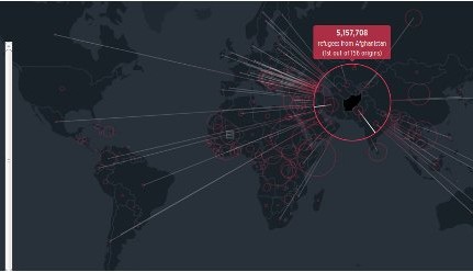
The Refugee Project visualizes the millions upon millions of people who were forced to flee their country due to war or repression. Starting with the 1.4 million in 1975, 0.2% of the world population to the 18 million in 2012 (0.3%). It is a testament to the devastating effects of political unrest on people's lives. In the '70s most refugees came from Angola and Ethiopia whereas for the last two decades Afghanistan tops the list with millions on the run each year.
The Atlas of Forced Human Migration was made by New York-based design firm Hyperakt and data designer Ekene Ijeoma. On the project's website the designers point out that the term refugee is narrowly defined in international law. A person must have fled to another country "owing to a well-founded fear of being persecuted for reasons of race, religion, nationality, membership of a particular social group or political opinion."
That means that The Refugee Project does not show all displaced people. In fact, it is only the tip of the iceberg. People who were forced to migrate for economical reasons, natural disasters or fled within their country's borders do not show on the map.
The data is provided by the United Nations High Commissioner for Refugees (UNHCR). The project website states:
The art of transforming large data sets into a narrative is gaining popularity. Understandably so, since the amount of data we produce doubles roughly every two years. Institutions funded by public money like the UN, The World Bank and NASA gather huge amounts of data. Much of that data is in the public domain. NASA is doing a pretty great job in storyfying their data to get information out to the public. But other institutions have a hard time making their dry numbers accessible in a meaningful way.
The Refugee Project is a prime example of visualizing data to make the numbers speak. The designers built the project in their spare time to show the possibilities of data design.
Via: Gigaom.com
The Refugee Project visualizes the millions upon millions of people who were forced to flee their country due to war or repression. Starting with the 1.4 million in 1975, 0.2% of the world population to the 18 million in 2012 (0.3%). It is a testament to the devastating effects of political unrest on people's lives. In the '70s most refugees came from Angola and Ethiopia whereas for the last two decades Afghanistan tops the list with millions on the run each year.
The Atlas of Forced Human Migration was made by New York-based design firm Hyperakt and data designer Ekene Ijeoma. On the project's website the designers point out that the term refugee is narrowly defined in international law. A person must have fled to another country "owing to a well-founded fear of being persecuted for reasons of race, religion, nationality, membership of a particular social group or political opinion."
That means that The Refugee Project does not show all displaced people. In fact, it is only the tip of the iceberg. People who were forced to migrate for economical reasons, natural disasters or fled within their country's borders do not show on the map.
The data is provided by the United Nations High Commissioner for Refugees (UNHCR). The project website states:
Under international law, the United Nations is responsible for protecting asylum seekers around the world. Through the offices of the UNHCR, and a separate agency for Palestinian refugees (UNRWA), the UN counts and tracks millions of displaced people as part of its larger task of safeguarding their lives and rights.
The art of transforming large data sets into a narrative is gaining popularity. Understandably so, since the amount of data we produce doubles roughly every two years. Institutions funded by public money like the UN, The World Bank and NASA gather huge amounts of data. Much of that data is in the public domain. NASA is doing a pretty great job in storyfying their data to get information out to the public. But other institutions have a hard time making their dry numbers accessible in a meaningful way.
The Refugee Project is a prime example of visualizing data to make the numbers speak. The designers built the project in their spare time to show the possibilities of data design.
Via: Gigaom.com
Read full article
Hide full article
Discussion (0 comments)